Sunday, November 8, 2020

Thread Talk SG (Featured Artist/Store)

Based in the metropolitan city-state of Singapore, Thread Talk SG founded and owned by Sagorika strives to positively impact the Indian weaving community, their fast-growing global consumer base and focuses on conscious sustainable fashion so as to leave a reduced carbon imprint. What I absolutely admire about this brand is:
~ Their timeless and classic creations that are not mandated by trends but rather driven by Sagorika’s love to keep the traditional weaves/crafts alive and thriving. 
~ Not tampering with the process and age old techniques of the bountiful and unrivalled craft and textile heritage of India and yet generating innovative and fresh designs that appeal to the new-age Indian woman. 
~ Embracing sustainability through and through – be it designing, sourcing, production or their distribution practices. 
I’ve first hand witnessed the quality of work and effort that Sagorika puts into the design and making of a saree. My collaboration with her has been in the works for over a year now (yes you read that right, that’s how elaborate and labor-intensive it is!). Finally, when the saree arrived, I was fascinated to see just how effortlessly, Sagorika had managed to bring 3 Indian states together in designing a one-of-a-kind saree for me. The only brief that I gave her for this customized piece was it had to be soft silk (as I personally like fluid and luxurious drapes), an Ashta Lakshmi theme for the palla and the saree in a color other than maroon. After which she took it entirely upon herself to design and execute it.
The finished saree is the outcome of Maheshwari silk handwoven in Madhya Pradesh that then travelled to Srikalahasti in Andra Pradesh to be penned for Kalamkari. Once that was done, it went to Bhuj (Gujrat) for the Kutchi embroidery and mirror work. As you can see, none of the traditional processes were manipulated in the making of this saree. Sagorika worked with each authentic craft cluster from the original state to which it belongs.
I had the opportunity to deeply understand the workings of the brand and the thought process of its owner and designer Sagorika. I now have so much more appreciation and respect for what she does. I hope this tête-à-tête with Sagorika gives you too a similar insight into the brand and its soul.
Hello Sagorika and welcome to TECD! Please tell us about your foray into the work of textiles and drapes and your brainchild Thread Talk SG? 
Armed with a Masters degree in Microbiology from Mumbai University and a post-graduate diploma in pharmaceutical marketing, it’s contrary to my creative field of designing and fashion that I'm pursuing currently. I had a short stint in the Insurance industry before I quit to settle into matrimony and move to Singapore. My love and appreciation of weaves has largely come from my mother who has impeccable taste when it comes to sarees. 
Thread Talk was registered as an entity in 2014 in Singapore when my first born turned 15-16 months old and I was craving to do something creative whilst still being able to devote significant time to him. I had already decided I wanted to work with weaves as there were not many options in Singapore if one really wanted to explore the rich plethora of Indian weaves. There was Nallis ofcourse but that largely curated Kanjeevarams and then there were other boutiques that made cheap imitations of the Bollywood inspired fashion with nets and synthetic fabrics loaded with bling. I ached to find Dhakais, Chanderis, Maheshwari’s, Ikkat’s, Kanthas or Kalamkaris. Once I had made up my mind on what I wanted to do, I started with the branding, name, logo etc. Threads being the very basic unit of weaves that I wanted to work with and Bread Talk being a very popular chain for breads and bakes in Singapore, I took inspiration from both to come up with “Thread Talk”.
Kindly highlight what sets your brand apart from others? 
Thread Talk started out with curating weaves but now most of what we showcase are our own creations, where we have been involved in designing and execution of the particular weave. While I prefer not to tinker with original weaving process, I often experiment with different yarns, natural dyes and sometimes try contemporary designs with traditional methods besides combining 2 or more traditional crafts to create a single, exclusive piece. As a Singapore based business, we are probably the only one that works with designing traditional weaves from scratch. But even otherwise, I’d say our USP lies in how we can see many regional crafts coming together seamlessly to create a one-of-a-kind piece.
What would you say has been the greatest influence on your designs? 
I wanted Thread Talk sarees to be able to narrate stories and be conversation starters. India is a land full of stories and mythologies and symbolism, so what better inspiration than India. Also, as Indians living outside of India, what more could evoke cosy, fuzzy emotions than stories from our own land.
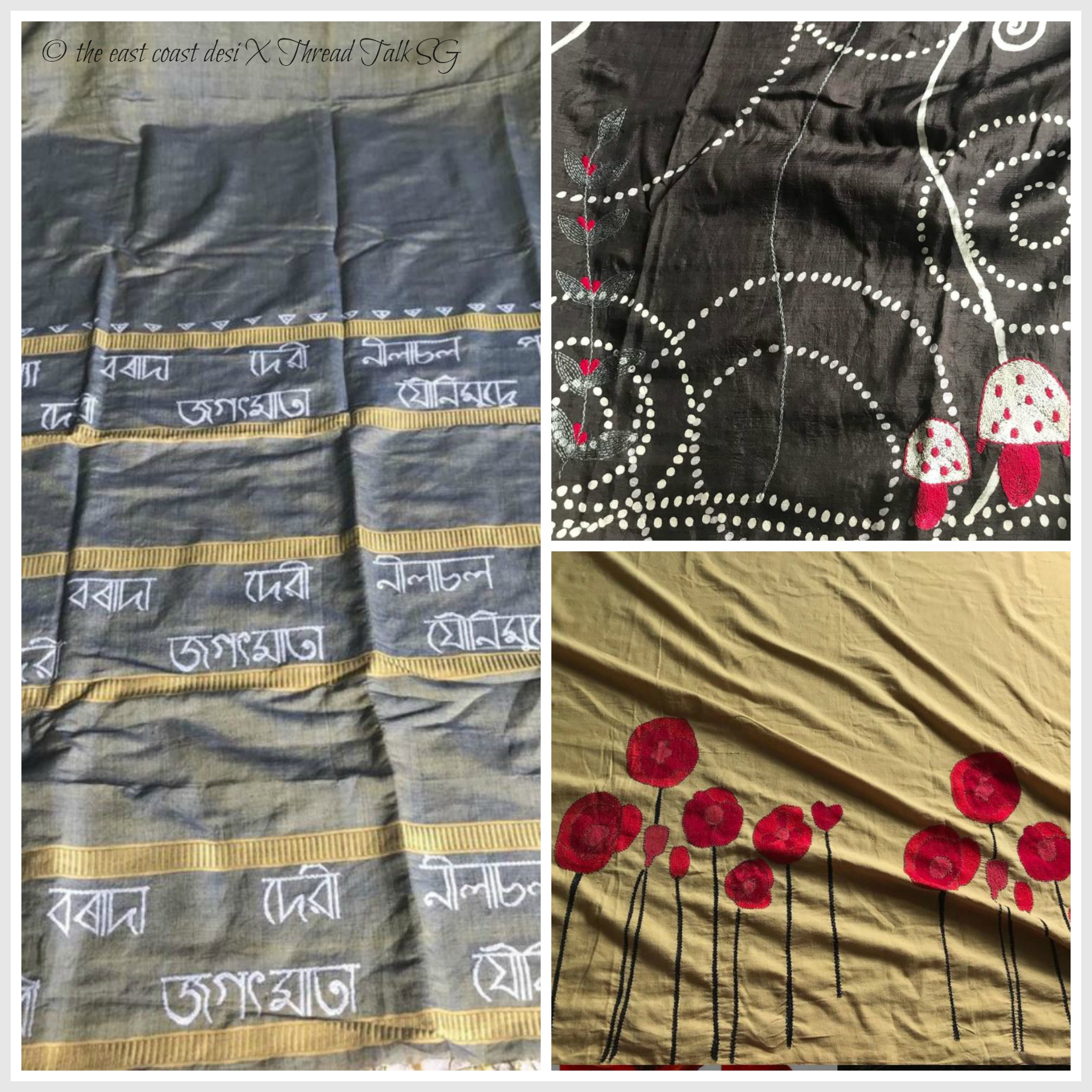
My biggest inspiration is India and all the thousands of stories that she holds within her. However, we are also looking at other cultures, other stories different from our own but which, nevertheless invoke a feeling of nostalgia. I Guess I am an old soul which is why I move backwards more than forward For eg: our Kantha + Batik saree featuring toadstools was totally out of an Enid Blyton book. The Poppy Kantha saree was also something that reminds you of Remembrance Day. So yes, India and the past era would be our biggest inspirations.
Please enlighten us about the design process that you adopt to create each piece/ collection?
The way Thread Talk works, it’s not possible to have one unit as these are all regional crafts and the artisans are geographically based in their respective craft clusters. So whether it’s weaving or embroidery, they all happen strictly in the craft clusters that they belong to. It would be mis-selling if not. Like I see a lot of Paithanis, Patolas, etc from Benaras. Those are definitely not authentic. We are very careful after learning along the way about these crafts and hence work with regional clusters only. For the regular “adda embroidery” and for tailoring we have separate units, other than that all work happens in original craft clusters and we take this very seriously.
I also see that you have branched out into the jewelry category too. What do you intend to bring to this section of your business?  
Though my main focus is on weaves, I have loved working with jewelry too. Like with our drapes, “wearable art” is an inspiration. Our first neckpiece was a pure silver Panchamrit spoon that we thought of as a pendant. Soon enough, I was working on a few more designs. Some involved making new ones where as others, like our Betel-nut cutter necklace just involved looking at the beautiful, vintage, artistic betel nut cutter in a different light to know it would make a fantastic statement necklace.
How would you describe your ideal Thread Talk SG woman ? 
For me, the woman who would resonate with Thread Talk’s designs would most importantly be someone who is extremely confident. She is someone who is mature and refined, takes pride in her roots and origins and will flaunt and promote them without any inhibitions. She is not someone who will be a crowd pleaser or someone who tries hard to “fit in”. Thread Talk designs are very subtle and never over the top! So it takes a woman of substance to be able to drape one without having to make a “bold, loud saree” or a more acceptable/ fashionable garment as her crutch.

What are your future plans for Thread Talk SG?
Because I have never treated Thread Talk as a business, I have never had any plans for it. I go with the flow. I just hope I can reach out to more people so they can see what we have to offer. When people appreciate the effort we put in behind creating a single piece, it gives us a high as no other. The focus is always on the craft. If people value the craft, if the design resonates with them, they buy it.
Where can one shop for these beauties?
No retails plans and no website either. I showcase everything on FB and IG and those in Singapore can always drop by to check out stuff and pick them. I’d never want to lose the personal touch in pursuit of commerce.” 

Finally, what would you say is the success mantra for a small business? 
There is no mantra! Also, how does one measure success. If I have to go by account books, Thread Talk fares poorly. If success is a measure of my happiness and sense of fulfilment, then I’m extremely successful. I love what I’m doing and in the small scale it is, I’m able to manage it as a one woman army. I often tell my husband I don’t want to lose this charm of a small, mumprenuer owned business. The day the joy of creating goes away and stress comes in, I’ll hang up my boots."
That brings us to the end of this feature and a motivating interview with Sagorika. She through her wonderful brand Thread Talk SG is here to harness the power of merging aesthetics, crafts, old traditions and ethical fashion. The interaction I’ve had with her has been such a pleasure and I see how her designs and work is an extension of her honest and authentic self. Hop onto her page and enjoy surfing their Facebook and Insta-gallery and I hope you’ll come away feeling tempted and inspired to order your own customized unique creations from them - be it sarees, jewelry or blouses.

(Photo Credits & Image Copyright: 2,3,7,9,11-Sruthi Singh for Thread Talk SG; 1,4,5,6,10 - Thread Talk SG: The images may not be used for commercial or non-commercial use without the prior written permission of Sagorika, Thread Talk SG & TECD.)   

Monday, October 5, 2020

Re-envisioning a place called Home (Home Tour)

Veshali Visvanaath (founder, curator and interior designer at the Singapore based antiques and furniture store Prakalyam Gallery) has an impressive portfolio of expertly designed and executed, residential and commercial projects. The latest from her portfolio is the 3,229 sq.ft. apartment in Singapore belonging to the beautiful couple, Kavitha and Irving. While the strong Asian aesthetic of the interiors compliments the couple’s aptitude to absorb the best from the cultures they are exposed to, the home is also reflective of the homeowner’s roots. Kavitha is originally from the South of India while Irving is from Goa. Veshali beautifully sums it up by saying, “It is always a lovely experience to be able to work with 2 cultures under one roof and to bring out the beauty in diversity.” 

Veshali tells me that Kavitha reached out to her after she had seen images of Veshali's other projects on TECD's Pinterest board. Hearing this gives me immense joy and brings so much satisfaction to what I do here on this blogging platform. 

Moving onto the topic of challenges faced by Veshali in the renovation of this project. She shares that the issues to be dealt with were very different when compared to any of her other projects. First, the COVID pandemic took a toll on the project deadlines. She confides saying, “The planning was in full swing when COVID hit and the work was stopped mid-way. The lock-down happened and in the next 3 months, we had almost forgotten what we had discussed with the client. Getting back on track after lock-down was a struggle but we were determined to make things happen and got the project back on track and had it completed in no time.” Second, the homeowners were moving to the same layout, a few floors above in the same building. The couple already had an enormous collection of art and furniture pieces. Veshali’s initial brief stated that she assist them in giving the home a fresh look with the existing inventory on hand. Veshali got down to it by using the pieces in a totally different arrangement and decided to renovate the space accordingly.

When it came to the renovations, Veshali saw to it that the home had an airy and spacious look. The seamless transition between the living and the dining is evidence of this fact and it lets the eye wander unchallenged and take in the treasure trove of art and collectibles that the homeowners have so lovingly amassed over time.


The neutral backdrop perfectly counterbalances the jewel tones used in the design scheme. It's the colors along with the art that add so much character to this space. 


An eye-catching cabinet with exquisite details anchors the space next to the couch. In addition to the collection of Buddha statues, different styles of painting and carved artifacts add the exclusive touches to the vignette.   

Along with upholstered seating options, I like how Veshali has casually introduced benches for seating. It makes things less formal and makes for a relaxed easy going vibe.

Another one of the bench style seating. This time its the versatile Charpai-look-alike bench that picks up the wheatish hues from the painting and the adjoining chair. The cushions and other accessories add the texture  and color to the little nook.

This beautiful cabinet has been converted to serve as the prayer alter table. Statues of Ganesha and  Hanuman along with a vintage painting of Mother Mary, all harmoniously occupy their rightful places at the alter. 

Another bright and functional corner with more seating and art. 
The couple has many unique pieces of furniture and art in their covetous collection. The ‘Howdah’ chair or sometimes called the ‘Elephant chair’ is one such elegant and refined piece. The adjoining bookcase lined with a collection of books beckons one to stay awhile and enjoy a good read. 
I've always admired Veshali's mastery at mixing colors and textures. You can see it first hand here as she beautifully brings this tablescape to life with a mix of  bright colors, ceramics and touches of fresh marigold.  
More incredible furniture, art and color on display in the transition hallway of the dining room. Fiery reds and intense blues definitely makes for a striking combination in this space.  

When one thinks of Goa, apart from the sea and the sand, its the bright and vivid colors as seen in Goa's Fontainhas Latin Quarter that comes to mind. Veshali decided to include these bold and vibrant hues to emphasize Irving's Goa association.  The couple were a little apprehensive about this but nonetheless, Veshali was adamant about her color choices. On seeing the final outcome, the homeowners were more than thrilled and it now happens to be their favorite hang out zone in the home.  
A close up of the farther end of the corner.  
Another angled shot of the balcony allows us to spot colorful portraits of Frida Kahlo. With that we come to the end of this wonderful home tour. Whether a new construction, restoration or renovations —  Veshali has addressed them all with experience, proficiency, imagination, and creativity. The resulting body of her work has always garnered numerous positive feedbacks from my readers and peers in the industry. I’m sure that this time too, you my lovely readers have enjoyed this exclusive home tour as much as I have enjoyed collaborating with Veshali in bringing this to you. Before I sign off, I'm leaving you with a lovely note from Veshali, "Kavitha was awesome to work with and she managed this home renovation  in the midst of presentation and submitting the final thesis for her PHD. As for me, I stepped out after the handover to the homeowners feeling completely satisfied. I was thrilled to see that they were admiring their old pieces all over again in  a new setting.  I take this opportunity to thank them for having me as part of this incredible journey. I would also like to thank you dear Sruthi as you have always been my inspiration. Gratitude for life!"  

Veshali the admiration and love is mutual. I'd also like to thank Kavitha and Irving for letting us take a virtual tour of their private abode. 

(My Singapore readers, should you wish to visit Prakalyam, please make sure to book your appointment right here or call (+65) 9008 3979. You may also write to Veshali at veshali@prakalyamgallery.com for design consultation.)

(Photo Credits & Image Copyright: Veshali Visvanaath for Prakalyam Gallery; : The images may not be used for commercial or non-commercial use without the prior written permission of Veshali Visvanaath & TECD.)  

Thursday, May 7, 2020

A Fresh Take (Home Tour)

It is believed that there are three responses to a piece of design - yes, no, and wow! Our consistent reaction to Veshali's designs have always been : WOW! Each of her renovation and interior design projects always tell a heartwarming and authentic story. In this Singapore based apartment belonging to Prashanth Nair and Manorama Singh, Veshali yet again successfully translates "their" story through her design process. To give you a brief on the young couple -  Prashanth is from Kerala while Manorama hails from Rajasthan. Veshali has incorporated subtle touches of both these Indian states throughout the 1,980 sq.ft. home without overwhelming the space. The end result being a home that creatively portrays the young couple's India connection while the finished look of the apartment has a decidedly modern feel. While it was a fun turn key project for Veshali, the 20 year old apartment came with a lot of challenges and guidelines. It not only required a lot of work in terms of changing the layout and the finishes but the most demanding client requirement was adhering to the rules of Vaastu Shastra. But Veshali worked closely with the homeowners and catered to every aspect to the extent that even the colors used on the walls were Vaastu friendly.  
Veshali as we know is adept at giving small spaces a big presence with bold, uncompromising design elements that get noticed. The entryway is proof of this fact. A beautiful painting was commissioned by the couple from Mona Biswarupa Mohanty popularly known as MonnerismsTogether with the Asian 4 door lattice cabinet it creates a strong focal point. The shade of azule was chosen to fulfill vaastu requirements and is the perfect backdrop for the fascinating painting that symbolizes the beautiful couple and the welcoming hand gesture of Namaste. To balance it all, Veshali teamed it with a pattern rich rug that emulates the happy colors in the painting.
The living room combines timeless style and modern comforts. It is anchored by a beautiful Kerala mural that was commissioned by Veshali through her gallery. To create the perfectly paired look, she has pulled the colors from the painting onto the Rajasthani glass work cushion covers. (Design Tip: Find a great piece of art and then build your colors around it.)
 The shade of poppy on the wall truly energises the space and balances the otherwise neutral setting. The oonjal (swing) that is so very significant with Veshali's south Indian decor style makes a comeback in this project. It is not only the couple's favorite spot to hang out  but is a huge hit with family and friends when they come to visit. The TV unit is another find from Prakalyam Gallery. The other furniture pieces in the living room were sourced by the couple in consultation with Veshali. Notice how the Kerala lamp and the Rajasthani turbans are a salute to the home owners roots. 
The coffee table was custom made by reusing the vintage doors from the home. Loving how stylishly livable this space is. By having off-white walls and a neutral floor, the details in the furniture  and the colors used in the space, really stand out and can be better acknowledged for their dramatic dimensions. 
As one can see, there are a lot of beautiful textures at play. The details of the oonjal can be better appreciated from this close up shot. Veshali excitedly adds, "The Oonjal has become synonmous with the gallery. It has been such a pleasure to see more and more homes in Singapore, incorporating the Oonjal. I am trying my best to avoid duplication of the designs and find myself experimenting to keep things fresh. This oonjal too was designed by yours truly to reuse a vintage panel as the back rest. I love how it has resulted in a contemporary feel to an ethnic piece." We couldn't agree more on how skillfully Veshali has elevated the look of the basic furniture piece with the beautiful details.
The grand doorway to the pooja/prayer room with the stained glass and intricate carvings was designed and fabricated by Veshali to match the original vintage doors of the house.  
If there's one word that succinctly describes Veshali Visvanaath's decor style, it's "Desi-chic." We can see the dining room undoubtedly echoing this individual style. There's brilliant use of textures in this room. From the woven blinds to the woven cane chairs, it all adds visual dimension to the space. Here too we see subtle references to the couple's individual roots. The Kerala boat is customized to serve as the light fixture while the Rajasthani block prints are framed to serve as wall art. She has managed to keep the look simple, intimate, functional and sophisticated, all at the same time.  
Another close up shot of this space from a different angel so that you can take in all the details. The framed art gracing the wall is a palla from a saree that belonged to Prashant's mother. What a beautiful way to personal a space and preserve a heirloom piece for generations to come! 
This beautiful functional corner is a clever combination of the very authentic Kerala urli used as the sink and  an ornate Asian mirror (that on first glance resembles like it was one picked from Rajasthan). The addition of the carved cabinets is cherry on the top.
The kitchen is definitely the zone where Veshali has pushed the boundary to include color and pattern. She tells me that Roma was always encouraging  when it came to the use of bold colors. The use of printed tiles in a combination of ocher and chestnut hues makes the kitchen a lively  and vibrant space like the rest of the home. 
Veshali in unison with Roma, decided to use glass to connect the kitchen and the dining areas together. The use of glass keeps the visual appeal light and airy. As for the decor accessories, the traditional Indian pickle jars, the Kerala "para"  (rice measuring container that is now used as a vase) and a few colorful ceramics (picked out by the couple from their travels) add the finishing touches to this space. 
This home has this charming quality where one could stare at it for a long time and find something new to love with every glance! Quoting Veshali's as we come to end of this beautiful home tour, "This was yet another home that paved the way for a tremendous learning experience. As always, loved the journey in creating a vibrant home for a lively and ever enthusiastic couple."

If you too wish to have your home designed by Veshali, you may reach her at (+65) 9008 3979 or write to Veshali at veshali@prakalyamgallery.com for design consultation. Should you fancy to visit the gallery, please make sure to book your appointment in advance. You could also connect with them via Facebook and Instagram.

(Photo Credits & Image Copyright: Veshali Visvanaath for Prakalyam Gallery; The images may not be used for commercial or non-commercial use without the prior written permission of Veshali Visvanaath & TECD.) 

Wednesday, March 25, 2020

Color Pact ( Home Tour)

It brings me so much joy to feature another beautiful home that is a potpourri of vivid colors and an unpredictable mix of furniture pieces and decor styles. Designed by my very talented friend and decor diva, Veshali Visvanaath of Prakalyam Gallery. This Singapore apartment (belonging to Sheetal and Jayesh) was not entirely a tabula rasa project. Reason being the clients wanted many of their furnishings and accessories to be reused as part of the new design plan. Veshali on the other hand admits that it would have been easy to work with a blank canvas but perhaps not as interesting and challenging. She had to decide how to manipulate the shapes, textures and colors of the things that they already had in inventory to get a balanced outcome that depicted the individual personality and style of the home owners and ensured that the design plan delivered a certain lifestyle that they would cherish for a long time to come.
Sheetal was certain that she wanted a happy space that was loaded with color and yet she had her doubts when it came to color being used on the walls of her home. But as we know, she was in great hands. Veshali listened very carefully to the client's briefing about what they had envisioned for their home. She decided that the best way to go about this was to use color in a restrained yet unexpected way. Turquoise, red and yellow were summoned to increase the color quotient in the design plan. She spruced up side boards, benches, cabinets, accent walls and textiles in the selected hues to punch things up. 
Another trick that Veshali had up her sleeve was to use pattern to enliven the space. Especially due to the lack of elements of architectural interest in the home, she thought it would be visually interesting to bring in a stenciled effect. The end result, Mandala designs that have been placed so very aesthetically without creating a busy effect. 
The achromatic backdrop not only brings about a bright and airy feel to the space but it also exaggerates the height of the room and works as the perfect backdrop for the bold and fun furniture pieces.
The beautiful coffee table was sourced from Prakalyam gallery while the ivory tufted couches and planters style chairs were purchased from a different vendor keeping in mind that the clients wanted  a  contemporary-eclectic style living room. The yellow bench was a lucky find from an online marketplace on FB.  There are a few oriental touches like the turquoise cabinet (originally in a walnut stain was given a face lift to sport the turquoise color), Buddha painting and sculpture (belonging to the client). 
There's also a hint of Rajasthani vibe  to reflect Sheetal's roots - the "Jaipur City Palace gate" prints hung above the couch, blue jharokah and the wooden musicians. The jharokas and musicians adorned the balcony of the house earlier. Veshali felt that by moving them indoors, they would bring a lot more to the space. Just the right placement can do so much when it comes to interiors.  
Loving how the space is playfully eclectic yet has a sophisticated mix of design styles! Only Veshali can effortlessly pull off something as challenging as this.              
Another angle of the living room so you can fully appreciate the flow of space and how thoughtfully the placement of furniture has been considered to maximize the square footage while providing ample seating options. 
The turquoise book cabinet was previously used as a prayer alter. Veshali got the doors of the cabinet removed, painted it  in a shade to tie it in with the rest of the color scheme and used it to display the home owner's collection of books and curios. The ornamental doors were too beautiful to be discarded so she gave them a new lease of life as wall decor (can be seen in the vignette below).  
Veshali shares with me that she was pleased that her clients were so trusting of her vision. The home owners' earlier coffee table has been relegated to be a side table to complete this vignette. A few wall plates, half stenciled mandalas and the intricately craved refinished wooden doors (now working full time as wall art) complete this beautiful composition. In her modest tone Veshali says,"I always say that a home is a reflection of the owners. I just help them achieve that reflection."
The client specifications for this project included a designated prayer room. Despite the space constraint, Veshali made this happen. Doors to the pooja room are fitted with little bells for an interesting ethnic touch.   
As for the dining area, Veshali suggested that they go with low seating as the original dining table was taking up a lot of space and made the corner look heavy. Sheetal seemed to like this idea, so they cut the old table to fit into the new setting and got  little stools to create a fun yet chic and functional causal seating.
A close up of the dining with the protagonist color palette, turquoise. The semi-circle mandala design and the suspended lights add such a nice touch to the space!  
The TV/ entertainment room has splashes of yellow to tie it in with the adjoining living room space that's sectioned off by means of a sliding door (perfect solution to make more room when you have people over).
The opposite wall of the entertainment room is in the preferred neutral tone which sets off the bright colors in the room. It also shows off a collection of favorite family photographs, a perfect way to personalize the space.

The master bedroom echoes the simplicity seen in the rest of the home. Custom woodwork was undertaken to create a niche for the bed. The woodwork also hosts the side tables so that the home owners may conveniently place their belongings within arms reach.   The dominant color being red in the room, it brings a deviation from the turquoise making for a bold look in this private retreat.
The daughter's bedroom is done up in shades of soft blue. Custom built shelves flank either side of the bed and provide organised storage. Above the bed, the letters spell "Ananyaa" giving the room the final personal touch.
I absolutely love the fact that this home tour was a departure from the very South Indian Style homes that we've seen Veshali design. It is casual, eclectic and brimming with color! Veshali take a bow for you have done it yet again - another home with a soul. If you too wish to have your home designed by Veshali, you may reach her at (+65) 9008 3979 or write to Veshali at veshali@prakalyamgallery.com for design consultation. Should you wish to visit the gallery, please make sure to book your appointment in advance. You could also connect with them via Facebook and Instagram.

(Photo Credits & Image Copyright: Veshali Visvanaath for Prakalyam Gallery; : The images may not be used for commercial or non-commercial use without the prior written permission of Veshali Visvanaath & TECD.)